600+
Stations monitored
Bike-sharing stations represented through real-time geographic and operational data.
Data & Business Intelligence
Transforming real-time mobility data into an operational decision-support dashboard.
The BIXI Operations Dashboard is a Power BI project built with real-world bike-sharing data to monitor station availability, identify operational pressure points and support faster operational decisions. The solution combines geographic analysis, real-time KPIs and temporal usage patterns in a single decision-support experience.
Analytics System
Operational Intelligence
600+
Stations
6
Core KPIs
Hourly
Analysis
Analytics Pipeline
From mobility data to operational decisions
01
Source Data
02
Power Query
03
DAX Model
04
Decision Support
Geographic monitoring · Station prioritization · Hourly availability analysis
600+
Bike-sharing stations represented through real-time geographic and operational data.
6
Key indicators covering available bikes, docks, capacity, usage and station conditions.
Hourly
Time-based monitoring designed to reveal availability patterns and operational pressure periods.
01
The Challenge
Bike-sharing operations generate large volumes of station-level data that change throughout the day. Raw data alone does not help operational teams quickly understand where bicycles are available, which stations are under pressure or when demand patterns change.
The challenge was to transform multiple operational indicators into a clear dashboard capable of supporting geographic, temporal and station-level analysis.
02
Data Modeling
The solution combines station information with frequently updated station status data through a structured analytical model.
Power Query was used to prepare and transform the source data, while DAX measures were developed to calculate current availability, capacity, full stations, empty stations and operational usage indicators.
03
Dashboard Design
The dashboard was designed around the operational questions users need to answer quickly: where availability problems are occurring, when bike availability changes and which stations require attention.
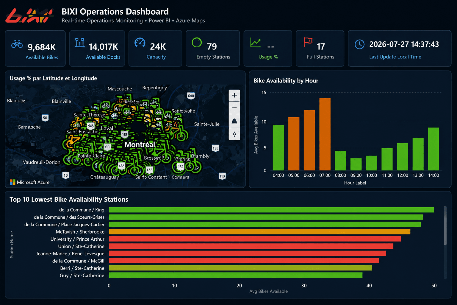
Azure Maps provides the geographic perspective, KPI cards summarize network conditions and supporting charts expose hourly patterns and low-availability stations.
04
Decision Support
The dashboard helps identify stations with low bicycle availability, stations approaching capacity and periods where operational intervention may be required.
By consolidating these signals into one interface, the report supports faster interpretation and creates a stronger foundation for bike redistribution and service planning.
05
Operational Dashboard
The final Power BI experience consolidates geographic, station-level and temporal indicators into one operational interface designed to support faster interpretation and decision-making.
Power BI Showcase
Real-time operations monitoring and geographic analysis
600+
Stations monitored
Bike-sharing stations represented through real-time geographic and operational data.
6
Core operational KPIs
Key indicators covering available bikes, docks, capacity, usage and station conditions.
Hourly
Operational refresh analysis
Time-based monitoring designed to reveal availability patterns and operational pressure periods.
Azure Maps exposes station availability and operational pressure points across the network.
Operational KPIs consolidate bikes, docks, capacity and station conditions.
Hourly patterns reveal availability fluctuations and periods requiring attention.
The report creates a clear foundation for redistribution and service planning.
Business Value
The dashboard transforms frequently changing mobility data into actionable operational signals, helping identify empty stations, full stations, low-availability areas and time periods where bike redistribution may be required.